Friday, August 29, 2014

Cinapro Nail Sugar

One of the things that showed up at Sally Beauty this summer was the Cinapro Nail Sugar Liquid Nail Art display, which was in my early July display post. All the displays I saw had eight colors of what looked to be chunky glitters, all with lights in the caps. Initially I only bought a couple of the colors to try but on subsequent trips to Sally as the summer went on, I eventually accumulated the whole set.


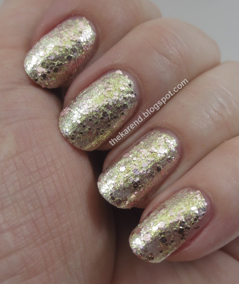
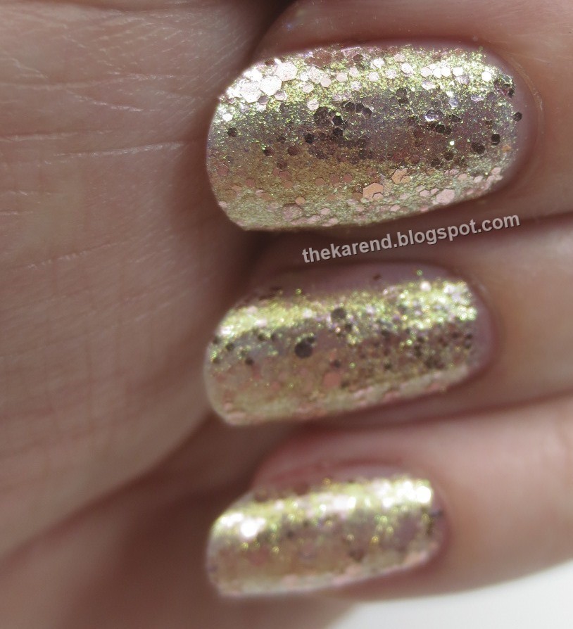
Golden Ticket has gold shimmer and microglitter combined with small and medium rose pink hex glitter in a clear base. I swatched this at three coats on its own. I didn't add topcoat, and it was just a tiny bit bumpy; with "sugar" in the name, I was expecting more texture. The gold was very shiny and metallic looking, with the pink glitter seeming to float on top of it. This could be worn alone; at some angles I thought I spied a hint of visible nail line but the gold was so blingy it distracted me from any VNL concerns.


I admit I did not try the light in the cap until I'd already put on my polish the old fashioned way, using the light in the room to see where I was putting the brush. The bulb is in a slim bumped out section along the side of the cap, and is turned on by clicking a push button switch on the top of the cap. It does put out a fair bit of illumination, though it can cast odd shadows if you don't take care to hold the cap so the light is not coming from behind the brush as you look at it. I did not try using it in a dark room, as I can't imagine what situation I'd be in where I would need to do a mani in the dark (people had best not be cracking these open in places like movie theaters). It's a fun feature, but not especially useful as far I'm concerned.


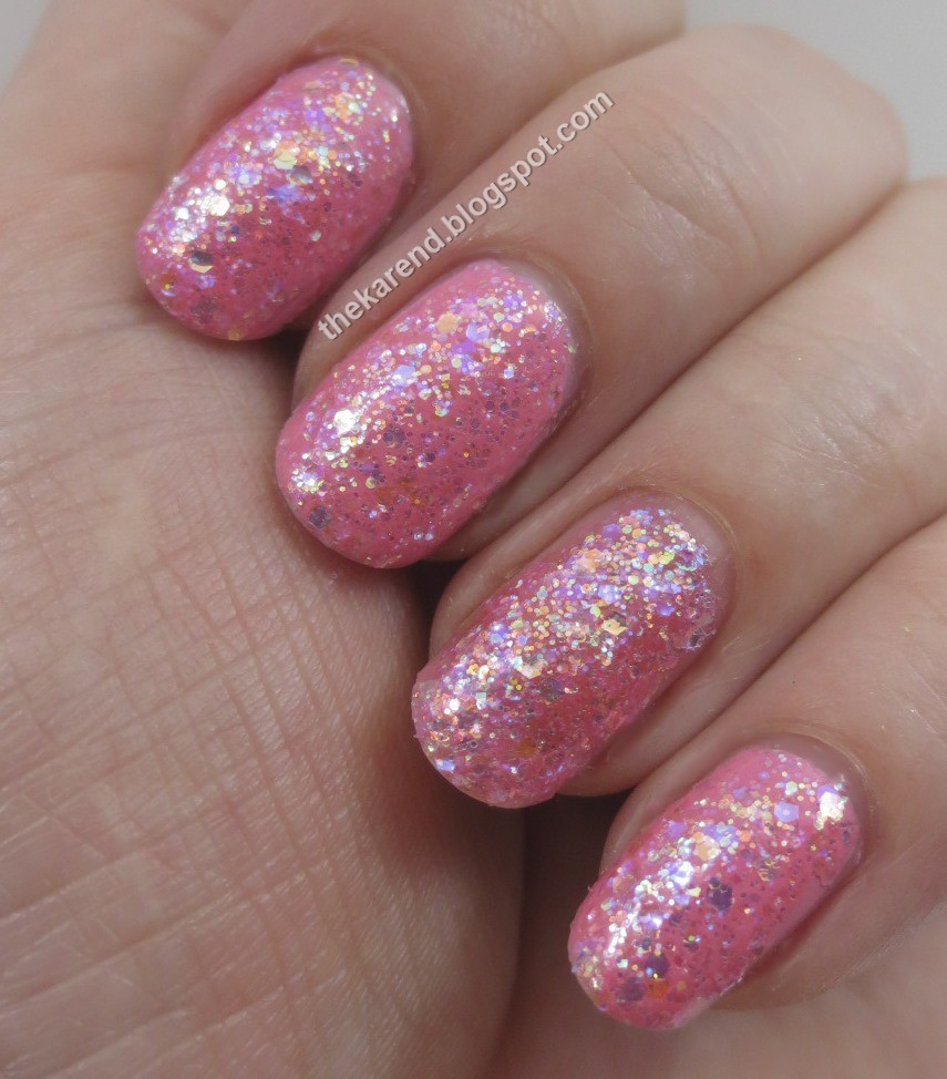
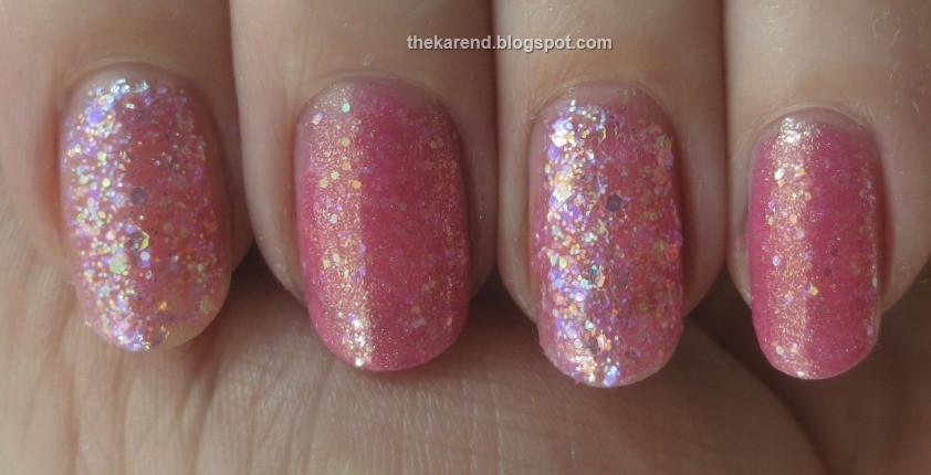
Cotton Candy has a sheer pink base packed with various sizes of iridescent glitter. I swatched this at three coats alone on my ring finger and two coats over NYC Lafayette Pink, a pink creme, on my other fingers. This could be worn alone, but I liked it better layered as a toppper.


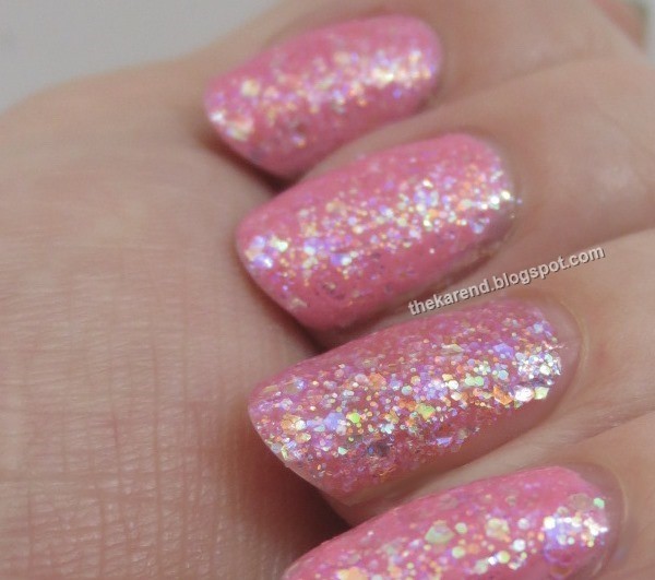
Cotton Candy bears a slight resemblance to Zoya Harper from this summer's Bubby collection, so I did a comparison. Left to right (3 coats each): Cotton Candy, Harper, Cotton Candy, Harper. You can see that Cotton Candy is the more blingy sister in the pair, with much more dense and colorful glitter. Harper's distinguishing characteristic is her gold shimmer, which Cotton Candy does not have.


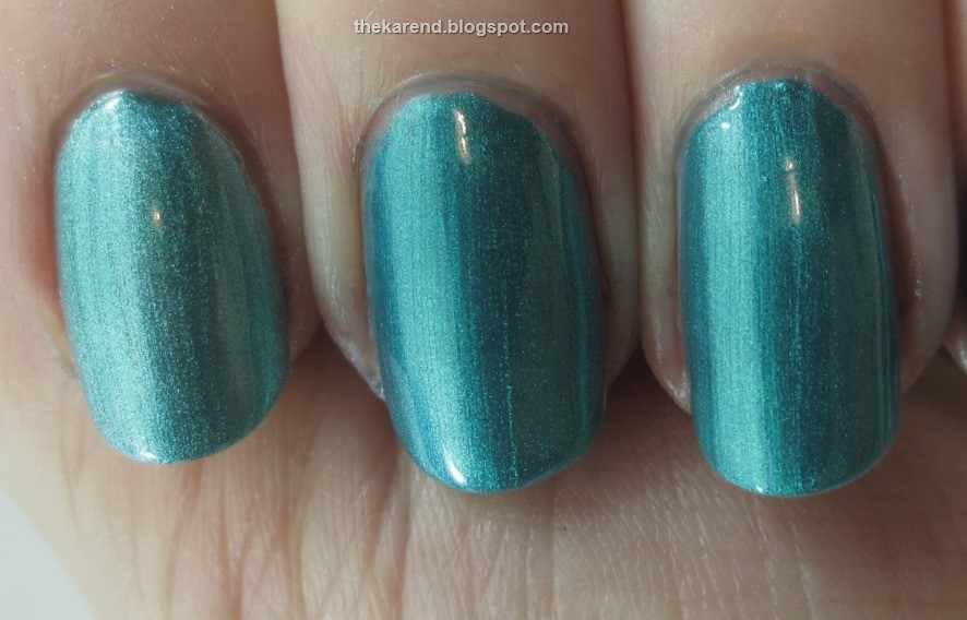
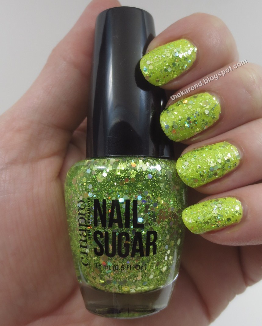
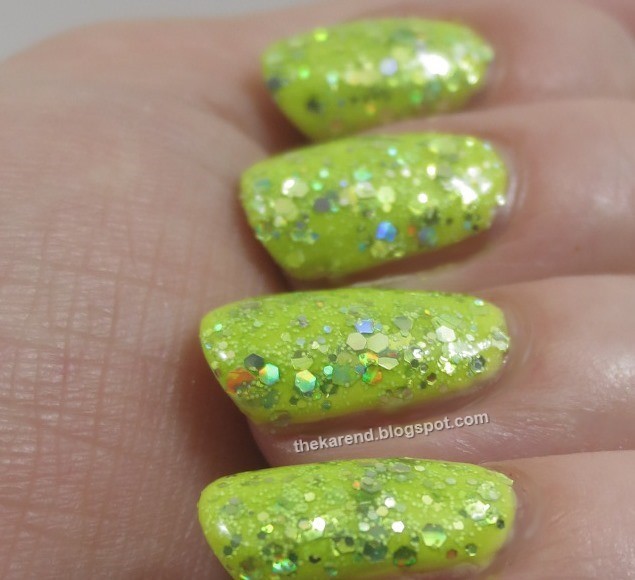
Hyperactive has various sizes of lime green and holographic glitter in a sheer green base. I layered 3 coats of it over SinfulColors Solar Flux, the yellow creme from this summer's Silk + Satin collection. I also added topcoat because I decided I was just being lazy not topcoating these Cinapros.


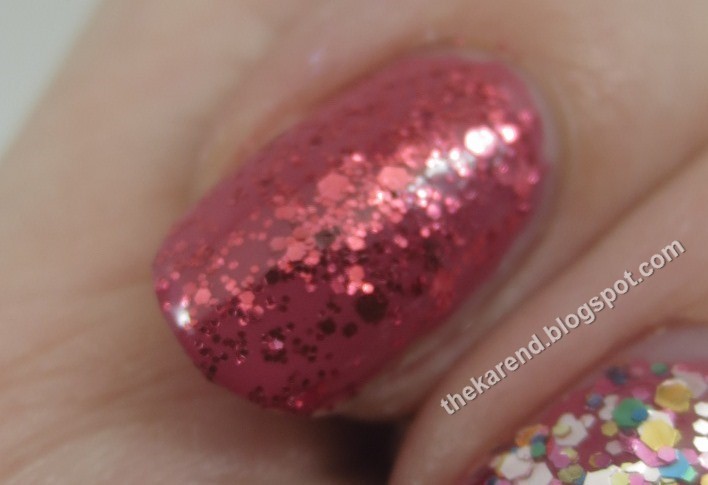
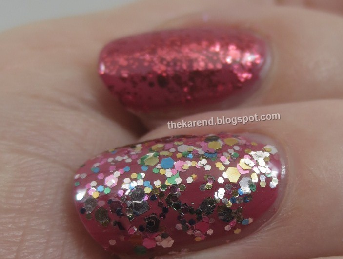
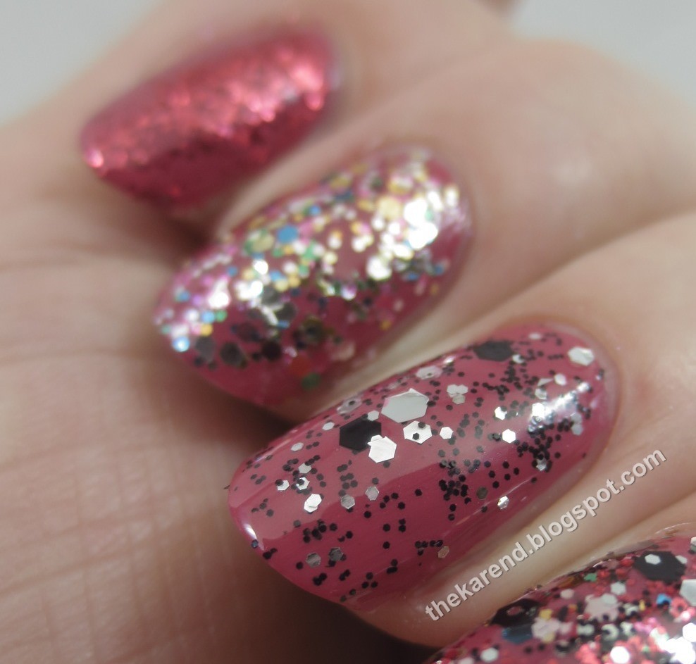
I decided that three of the colors would look good over the same base, and might look good layered with each other, too, so I put down two coats of Butter London Dahling, a deep dusty pink creme. On my index finger, I added two coats of Cherry Cola, which has small and medium red glitter in a clear base. On my middle finger, I did one coat of Sugar Rush, a multi-colored glitter mix in a clear base (the multi colors are silver, gold, green, blue, and hot pink). I topped my ring finger with one coat of Black Licorice, a silver and black glitter mix also in a clear base. On my pinky, I did one coat of each of the three glitters. I slicked clear topcoat over everything, then utterly failed to take even one photo where all four nails are in focus at the same time.


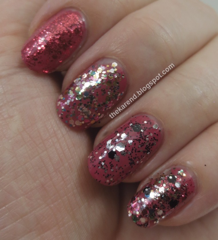
I think putting all three glitters together was one glitter too many. I think any pair of them would have been great, but I didn't take the time to experiment with that.


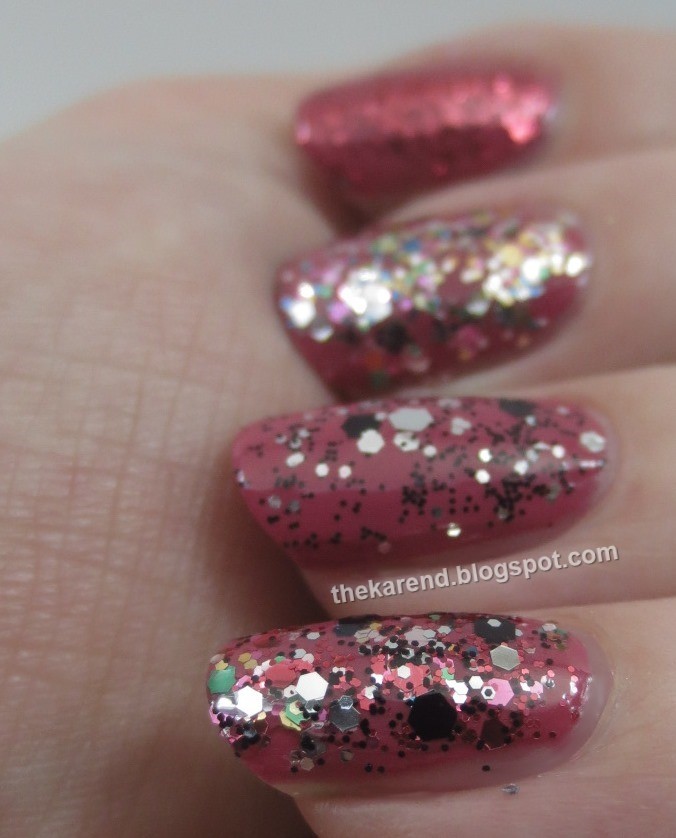
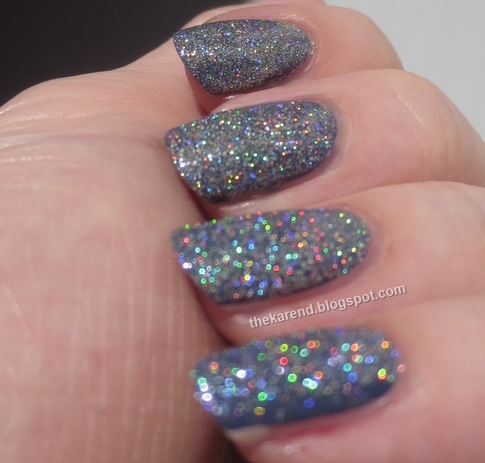
I did take the time to do a bunch of detail shots of this look before I moved on:


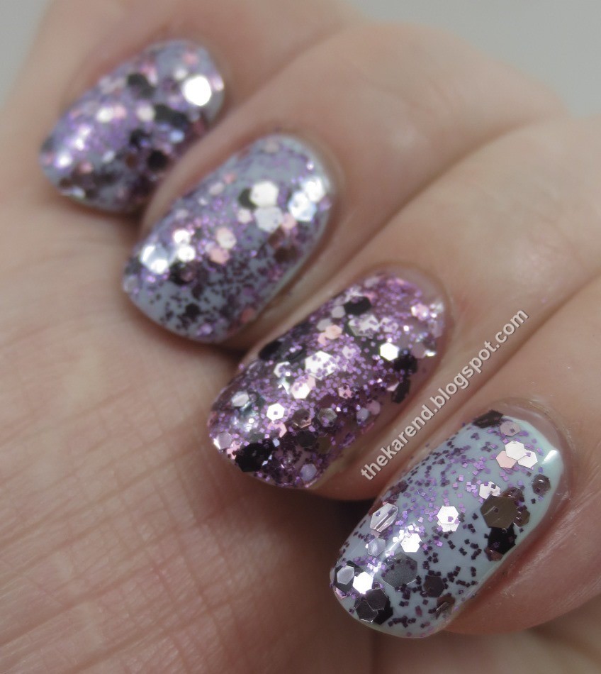
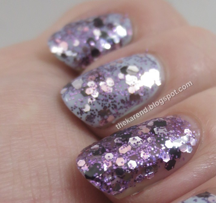
Rock Candy has small purple square glitter with larger black, silver, and pink hex glitters in a very sheer purple base. I did four coats of it by itself on my ring finger for an accent nail, while on my other digits, I did two coats of Rock Candy over NYC Robin's Egg Blue, a pale turquoise blue creme. I put topcoat over everything, too. I thought this would be my favorite because purple, but on the nail I felt the hexes dominated the mix too much.


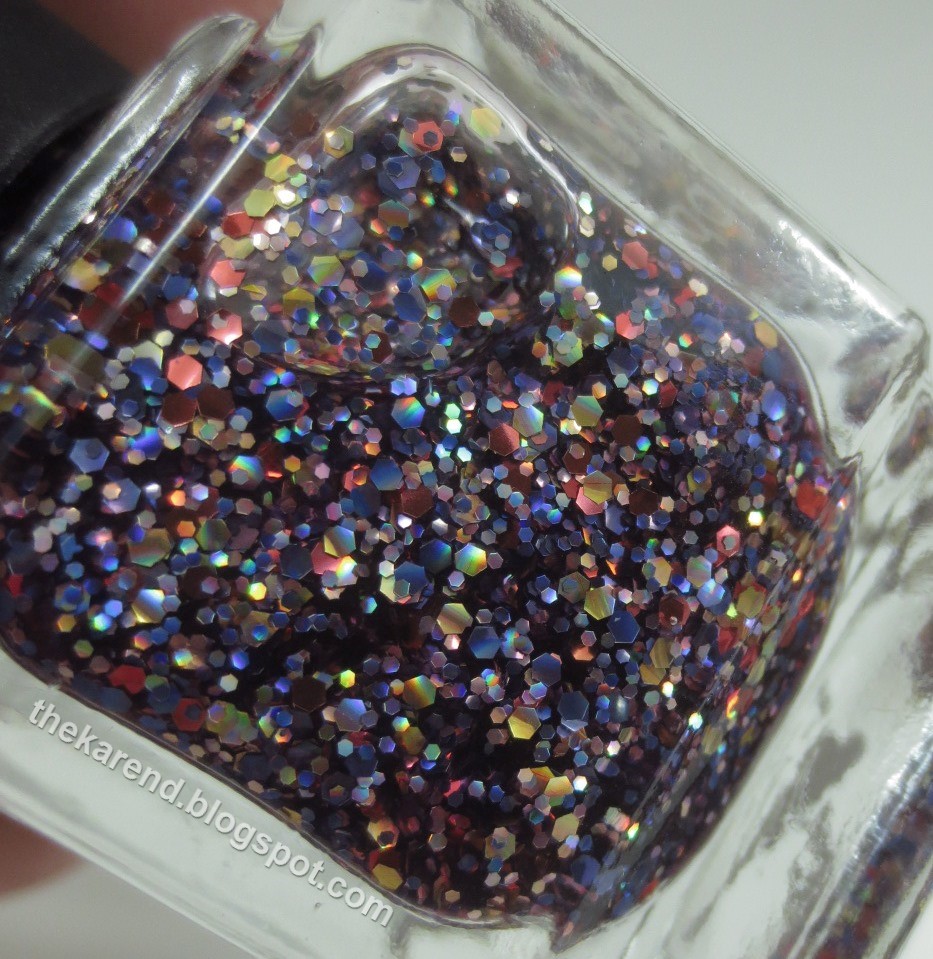
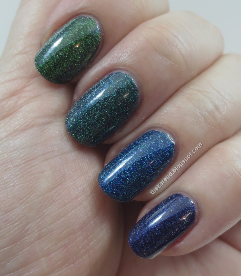
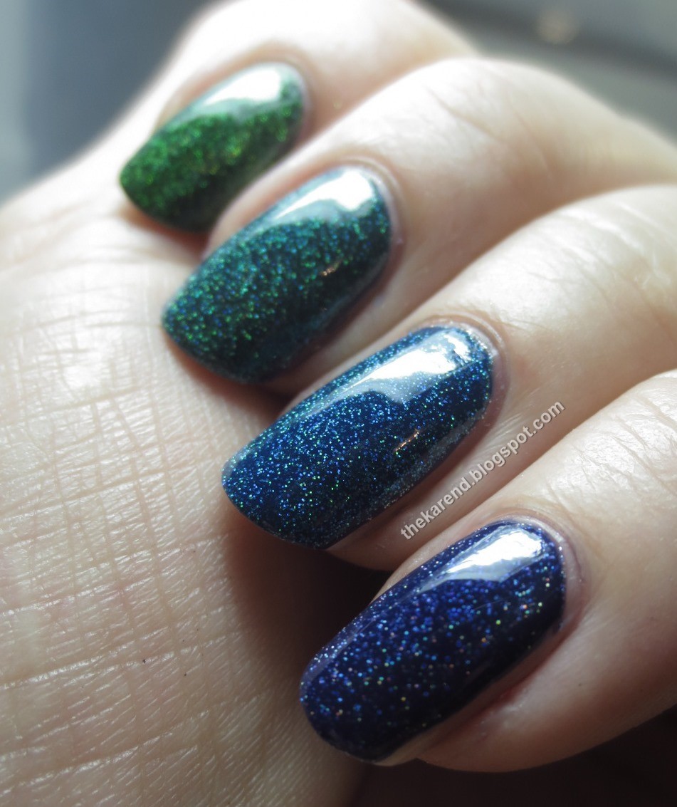
I noticed that the last polish, Sweet Tooth, was showing some duochrome in the bottle, so I laid down a black creme base (Wet 'n' Wild Black Creme, my go to black) on all but my ring finger accent nail, the better to bring out any duo there was. I did two coats of Sweet Tooth over the black and three coats of it alone on my ring finger. All nails then got clear topcoat. Sweet Tooth has white shimmer as well as blue/purple shimmer and microglitter plus medium and large blue glitter in a clear base. I was very pleased to see that the color shift I spotted in the bottle also showed up on my nails, even the one where I did not use black underneath. I think is is similar to Ciate Risky Business, but I've only seen that one at Sephora, I've not tried it on my nails.


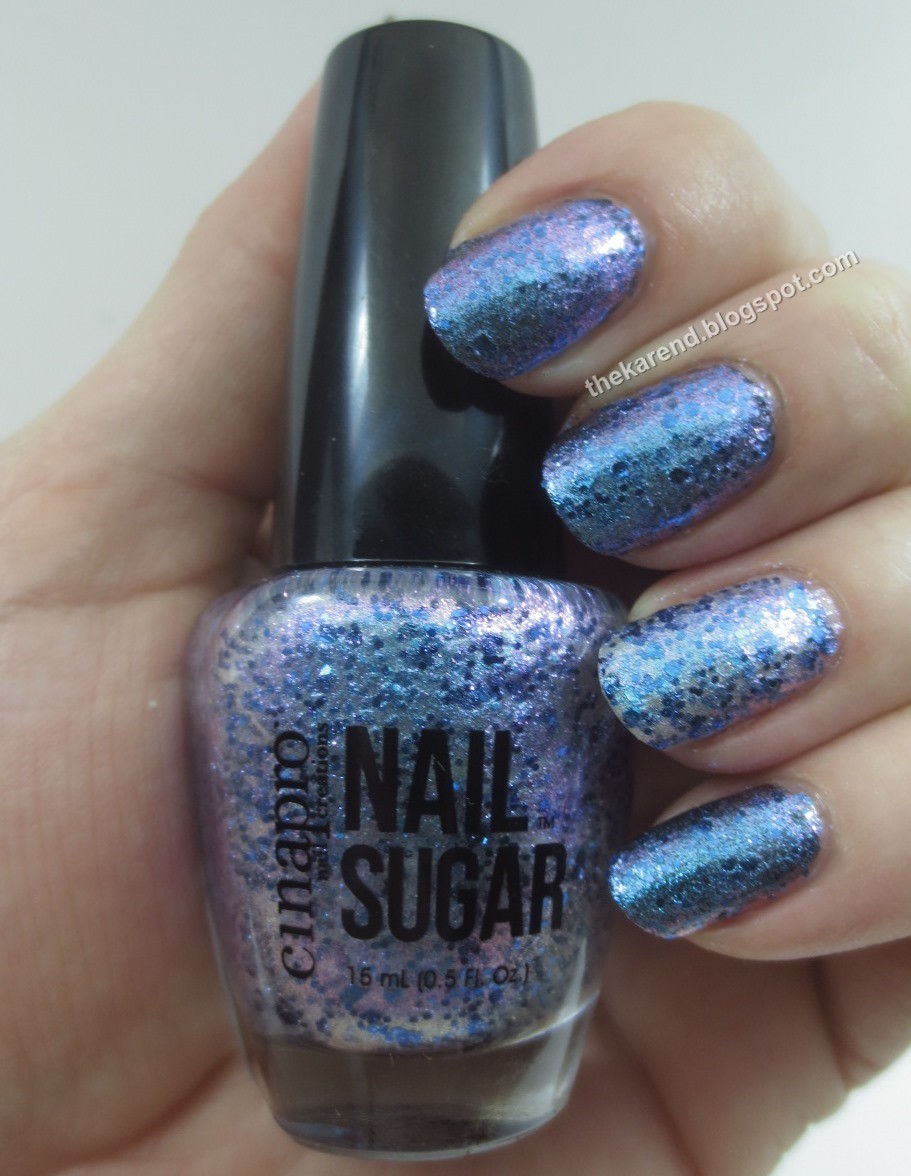
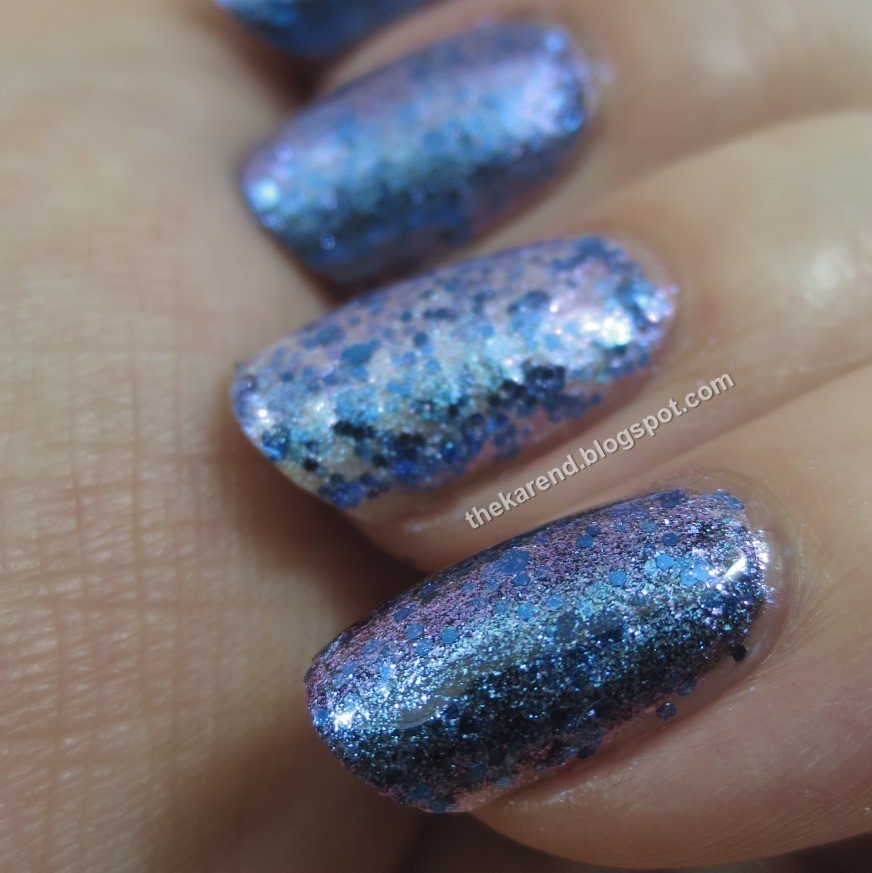
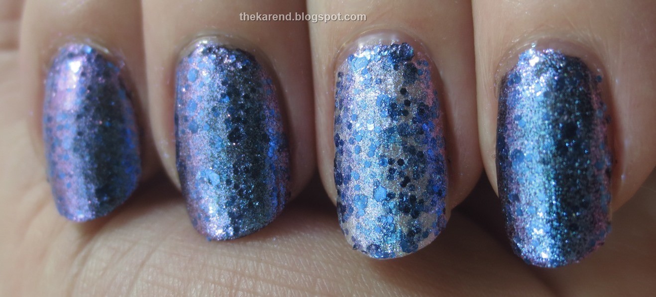
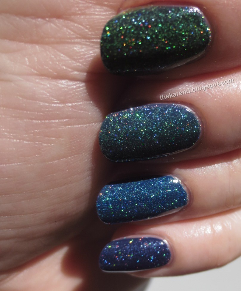
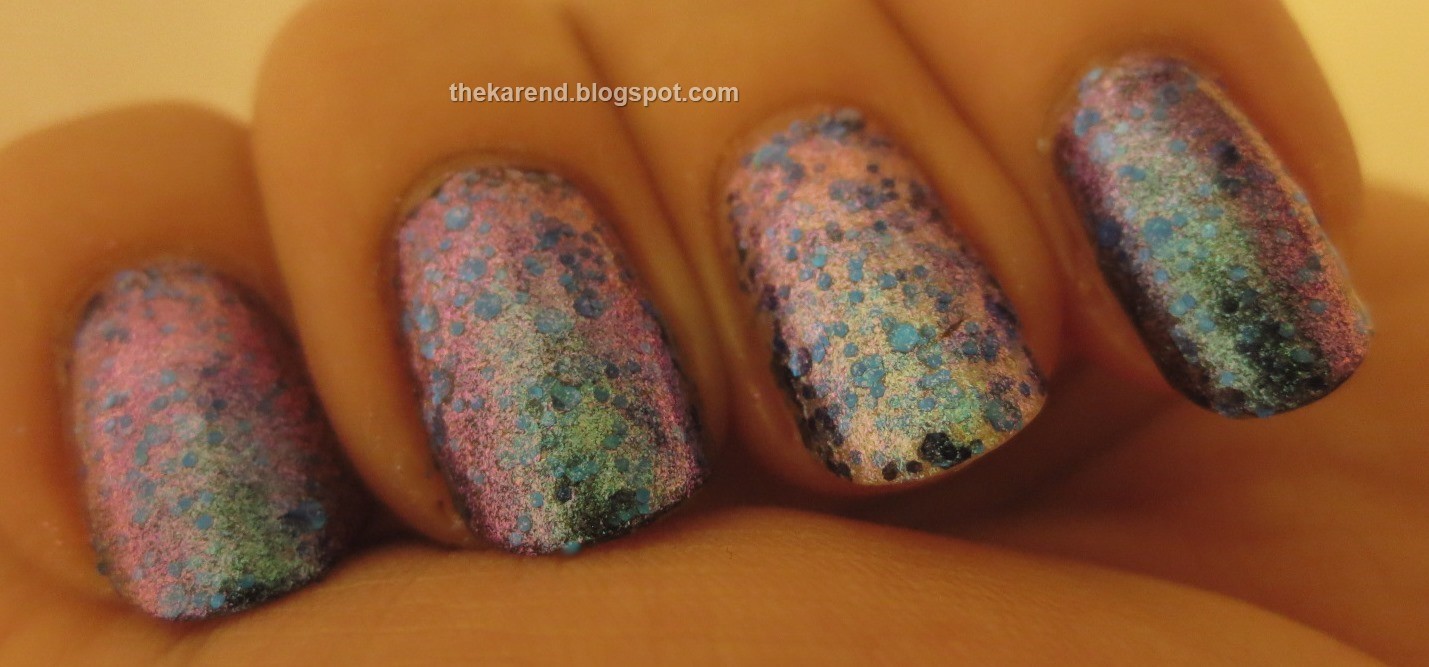
Mostly Sweet Tooth shifted between purple and blue, with the blue glitter popping more or less depending on what the base was doing. But look at this craziness when I turned the lights down low—pink and green came to join the party, too. I was fascinated with this. I mean, I've seen multichromes before, but never expected this polish would bust out so many colors, especially since none of the other ones in the collection were nearly so complex.


Apparently (apparent from a press release I found online) there are two other colors in this collection: Creamsicle, described as "orange jelly base with fine particles of orange and gold" and Salt Water Taffy, "a clear jelly base with fine silver glitters". Where one would get those I have no idea, as all the Sally stores I've been to only have the eight shades I swatched. I'm okay with missing silver glitter in a clear base, but the orange one sounds interesting.

These Nail Sugars are the first Cinapro polishes I've ever seen, much less tried. I can't find a price for these online; I think they were in the 8 dollar range at Sally Beauty with the card and monthly coupon.

Thursday, August 28, 2014

Same Name, Different Polish

It's been a couple months since Sally Hansen changed the color and finish but not the name of Pacific Blue in the Xtreme Wear line, sparking much discussion in the nail polish fan community. The company did issue a statement on the change, as reported on Nouveau Cheap, but seemed to miss one of the main points of contention: using the same name for a new color is a bad idea, if only because it's confusing for people looking up swatches or trying to buy/swap a certain shade. Of course Sally Hansen is not the first or only company to pull this stunt (I don't know if OPI has ever acknowleged they changed My Private Jet, for instance), just the one that grabbed our attention this summer.

Since I love comparisons, I had to buy the new Pacific Blue (hmm, maybe they knew a bunch of us would react that way). When I finally got around to pulling it out to swatch, I was very surprised to find my bottle had no brush—I've never had that happen with Sally Hansen before—other brands, yes, once in a great while, but never Sally Hansen. Rather than try to find the receipt and trek back to the store, I found a nearly empty bottle of Insta Dri topcoat, cleaned the brush off, and was pleased to find it fit the Xtreme Wear bottle just fine. Also, due to my not noticing someone had put a light blue that didn't belong in the Electric Summer display, I'd ended up with a second bottle of Breezy Blue, with the new "long leg" X on the bottle, so I decided I'd compare those, too.


On the nail below, in the same order as the bottles above: Pacific Blue (new), Pacific Blue (old), Breezy Blue (old), Breezy Blue (new).


Same order, but in more direct light:


Breezy Blue shows that Sally Hansen can keep a formula consistent; both old and new are pale blue with a somewhat subtle shimmer. Pacific Blue, though, that's just wrong. They did keep it blue, yes, but the new version is a darker shimmer, nothing like the old vibrant creme.

I'm especially puzzled by the change in Pacific Blue because there already was a royal blue shimmer in the Xtreme Wear line, Blueberry Blast. There's a royal blue shimmer in the Complete Salon Manicure line, too, Batbano Blue, so I grabbed that and a similar shade from iko that was lurking about just itching to get in on a comparison.


On the nail below, same order as the bottles above: Pacific Blue (new), Blueberry Blast, Kiko Quick Dry 830, Batbano Blue. New Pacific Blue and Blueberry Blast are pretty much the same as far as I could see, which makes me wonder if when they pulled Blueberry Blast from the lineup they had vats of it leftover but no more labels so decided to put it out in Pacific Blue bottles. Batbano Blue is a touch lighter, as is the Kiko. The visual texture of the shimmer in the Kiko is more pleasing to me, so when it comes time to cut back my royal blue shimmers, it'll stay and Batbano will go.

Sally Hansen is not the only brand that's been messing with formulas recently. SinfulColors has at least two instances of same name, different polish in their summer displays. Here are the old and new versions of Charmed and Let's Meet.


On the nail below: Charmed (old), Charmed (new), Let's Meet (new), Let's Meet (old). Charmed went from a full coverage silvery microglitter with multicolored accents to a slightly sheer golden microglitter. Let's Meet morphed from a golden yellow shimmer to a bright yellow creme.


The odd thing about Let's Meet is I've seen both versions out this summer, with the creme one only showing up in my area in the Get Schooled Art Major display at Rite Aid stores. Perhaps all those displays got filled from a batch of something else that just got mislabeled?


When I run the world, there will be strict rules about this sort of thing. If you change a color, you're gonna have to change the name.

Wednesday, August 27, 2014

Wheels W7 and D8: Pink and Red Cremes

The last time I shared any pink or red cremes on Nail Wheel Wednesday was when C4, O5, and F6 shared the limelight way back in January of last year; there are links in that post to the nine pink/red wheels that came before, and one might think that 220 cremes in this color family would be quite enough for one person's stash, but no, today I have two more wheels (and I know there are at least enough polishes for two more in my untried drawers/boxes). I think at some point me and my stash need to go live on a deserted island (preferable one with a nice climate and not too many scary creatures) and not come back 'til I weed out enough polishes to at least get rid of the overflow boxes and just have my Helmers.


1. Kleancolor Sheer Pastel White
2. L'Oreal Penthouse Pink
3. Cosmetic Arts unlabelled
4. Barry M Pale Pink
5. Revlon Nail Art French Mix Sweet Revenge
6. Essie Off the Shoulder
7. Nails Inc. Notting Hill Gate
8. Essie Lights
9. Sally Hansen Insta Dri Fast Fuchsia
10. Cult Nails Bad Devious Nature
11. FingerPaints Flip Flop Fuchsia
12. Sally Hansen Insta Dri Magenta Moves
13. Black Radiance Girls Rock Super Star Status
14. Sally Hansen Complete Salon Manicure Cerise
15. Cult Nails Evil Queen
16. OPI Do You Think I'm Tex-y
17. Maybelline Revitalizing Color Plaza Plum
18. Revlon Top Speed Diva
19. Barry M Raspberry
20. Revlon Nail Art Moon Candy Satellite

Bottles 1 through 4:


5 through 9:


10 through 14:


15 through 20:


1. Essie Cascade Cool (3 coats) [would have been at home on a red violet wheel, along with #2]
2. Cosmetic Arts unlabelled (3)
3. OPI If You Moust You Moust (3)
4. Sinful Colors Fusion Neon (3)
5. FingerPaints Warhol Wannabe (3)
6. Orly Beach Cruiser (3)
7. Studio M Neon Pink (3)
8. Pop Beauty Pinkest (2)
9. Wet 'n' Wild Fergie Fergalicious (2)
10. FingerPaints Pink Perspective (2)
11. Studio M Infusion (2)
12. Color Zone unlabelled (2)
13. Ula Professional Ka Pow (2)
14. OPI Do You Think I'm Tex-y (3) [not sure how this got on this wheel as well as the previous one; it does appear to be the same bottle judging by the label smutz by the I]
15. Butter London Snog (2)
16. Essie Marathin (2) [looking sort of mauve-y]
17. American Apparel Rouge (2)
18. Butter London Pillar Box Red (2)
19. Essie Head Mistress (2)
20. Butter London Saucy Jack (3)


Bottles 1 through 5:


6 through 10:


11 through 15:


16 through 20:


Tuesday, August 26, 2014

Deborah Lippmann Recipe for Love Trio and Cosmic Love

One of the temptations I succumbed to during the Nordstrom Anniversary Sale was the Recipe for Love set from Deborah Lippmann, a trio of mini polishes: You Got Me Started (grey creme), Make Someone Happy (glitter/shimmer topper), and Let's Stay Together (deep berry creme).


I tried the cremes on their own first, at two coats each. You Got Me Started is a cool grey, on the lighter side but not what I'd call pastel. Let's Stay Together is a slightly dusty deep but not too dark plum; for some reason this pulled much darker on me than it did on the polish insomniac. Both of these looked a touch sheer on the first coat but were perfect by the second.


Make Someone Happy, the topper in the set, has large peachy glitter, medium sized pastel pink glitter, small iridescent glitter, and pink/blue shimmer.


I used one coat of the topper on Let's Stay Together and two coats on You Got Me Started (the accent nail), then added topcoat to smooth things out.


My favorite part of Make Someone Happy was the shifting shimmer. I think if it had just that shimmer plus the iridescent glitter, this would be a much more versatile topper. I didn't care much for the big peach glitter, so wasn't unhappy that it was a bit hard to coax out of the bottle. The peach over the grey in particular bothered me for some reason.


As long as I was buying Lippmann, I also picked up a full size glitter topper called Cosmic Love. This is a festival of holo and metallic glitter in purple, gold, and rose gold.


The natural thing to do would have been to layer Cosmic Love over one of the cremes from the set, but since those are minis I didn't want to deplete them so fast. Instead, I used Cover Girl XL Rotund Raspberry as my base color, followed by 1 to 2 coats of Cosmic Love plus topcoat.


I would not change a thing about Cosmic Love. The only challenge I had with it was restraining myself from building up more coats so I could see more of the pretty glitter on my nails.


Deborah Lippmann is pricey, no doubt about that, but the bottles are very nice and her glitters especially are usually quite good, so I'm fine with splurging on them now and again.

Thursday, August 21, 2014

Wet Paint Nails Continued

You may recall that earlier this summer Wet Paint Nails kindly sent me a bunch of polishes for review, and that when I did my second post about the Wet Paint Nail Glaze System I mentioned I had still more combinations to share. Being me, I got distracted and am only now getting around to wrapping up writing about my experience with this first batch of colors I tried from Wet Paint.

Let's kick things off with Shock & Aqua, a light turquoise creme. I used two coats for my swatch; the formula was quite nice.


To all a little something to Shock & Aqua, I topped it with two coats of Carmel Breeze, one of the shimmery Special Effects polishes.


The blue glow from Carmel Breeze was particularly glow-y in low direct light:


When I topped Shock & Aqua with Pearly Girl, the other shimmery Special Effects color, it gained a soft pink glow.


The pink from Pearly Girl really came out in direct sunlight:


Bimini Blue is a deep blue creme that's just a tiny bit purple-leaning. It's not too dark and always looks blue, not black. It's also opaque in one coat. I added topcoat to my swatch only to smooth out the hints of ridges showing from my non-basecoated nails.


Bimini Blue makes a great base for the Special Effects polishes. Top to bottom below: Bimini Blue alone, with two coats of Carmel Breeze, with two coats of Pearly Girl, with one coat of Crystal. It's hard to pick a favorite combination here. Carmel Breeze makes it vibrant; Pearly Girl makes it purple, and Crystal makes it sparkly. I like all those things.


On this particular day, sparkly won out, and I did a whole hand swatch of Bimini Blue plus Crystal (one coat of each plus topcoat). My camera apparently found this look distracting and all of the shots I took are slightly out of focus.


When I took this combination outside in the sun, the sparkle popped with so many rainbow colors. Talk about distracting!


Much as I enjoyed looking at Crystal, I was impatient to see how it would look under some of the Jellies. Top to bottom below, it's the Bimini Blue plus Crystal combination topped with: Go Fly a Malachite, I Am Aquagirl, Waterfalling for You, and Inky Nights. I love the ombre effect of these four together.


I also liked seeing Crystal sparkle behind the jelly: subtle but adds a lot of interest to the look. Here it is in low direct light indoors:


And in the sunshine:


I used Always Buy Platinum, a silver metallic, as an accent nail with Teal Me I'm Pretty, a teal shimmer. Both were two coats.


Just for fun, I put one coat of I Am Aquagirl over Always Buy Platinum, and that turned the silver into a near dupe for Teal My I'm Pretty.


While writing this post, I kept clicking over to the Wet Paint website to double check color names, which just whetted my appetite to get more of their colors, especially in the Jellies section—they've got some pastel ones that look especially intriguing. Jellies and Special Effects are priced at $8 a bottle, while base colors (cremes, shimmers, metallics) are $6.

The polishes shown in this entry were provided free for review purposes. The content of the entry was not dictated by the provider, and I get to keep the polishes for my own use.