Friday, August 30, 2013

End of August Displays

My photo folders for displays on my computer are once again bulging at their figurative seams, so you know what that means: super mega long display post. Actually, this one might not be as long as usual because in the interest of getting this done sometime today, I'm going to skip my usual practice of sharing all the display variations I come across for a given collection—I like seeing them all but some of these brands are putting out so many different displays for the same colors that I just can't keep up. For instance, I've seen Cover Girl Glosstinis displayed at least a half dozen ways, and Revlon Brilliant Strength is spreading across the landscape in displays big and small, with other makeup and without.

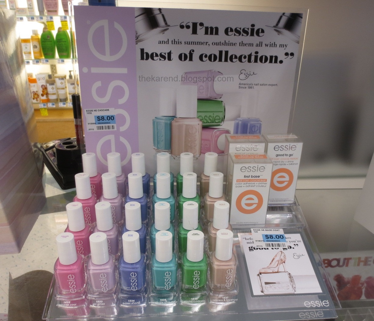
Many of the things I have to share today are fall colors, but Essie is giving summer one last hurrah with a "best of" collection showcasing colors from previous summer collections (well, maybe some were spring collections; they're summery colors, anyway): Cascade Cool, Go Ginza, Boxer Shorts, Where's My Chauffeur, Mojito Madness, and Topless & Barefoot. I spotted this particular display at Rite Aid but have also seen the colors at CVS in a section of the Nail HQ.


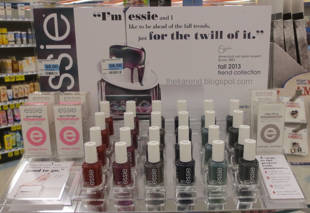
Essie's fall collection for 2013 is For the Twill of It. This has six colors with clothing/fabric inspired names: Twin Sweater Set, The Lace is On, For the Twill of It, After School Boy Blazer, Vested Interest, and Cashmere Bathrobe. The display below is a retail version seen at Rite Aid. There's a four-color retail one I've seen at Walgreens; that lacks Twin Sweater Set and After School Boy Blazer. Some CVS stores have these colors in the Nail HQ. Ulta has the salon version of the bottles, of course.


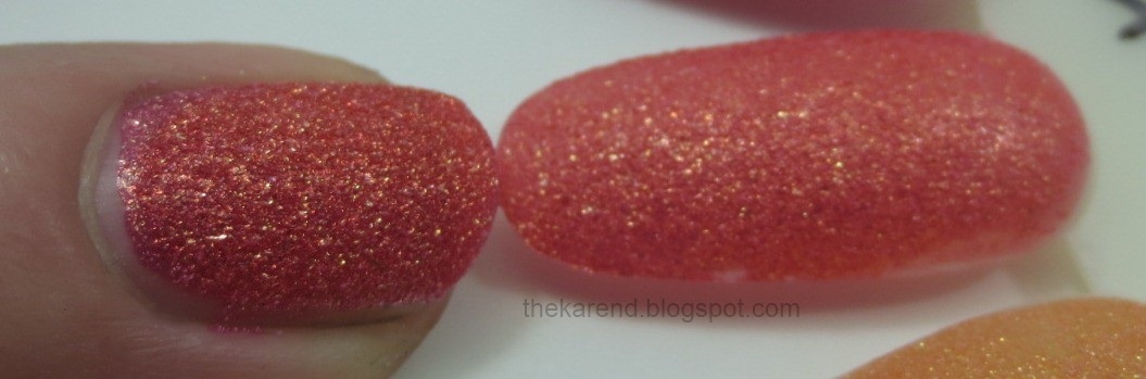
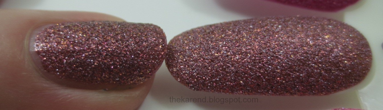
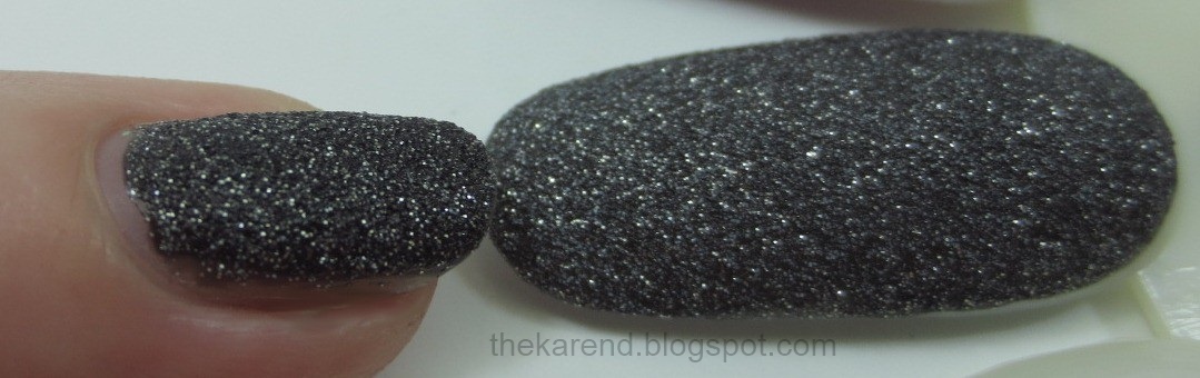
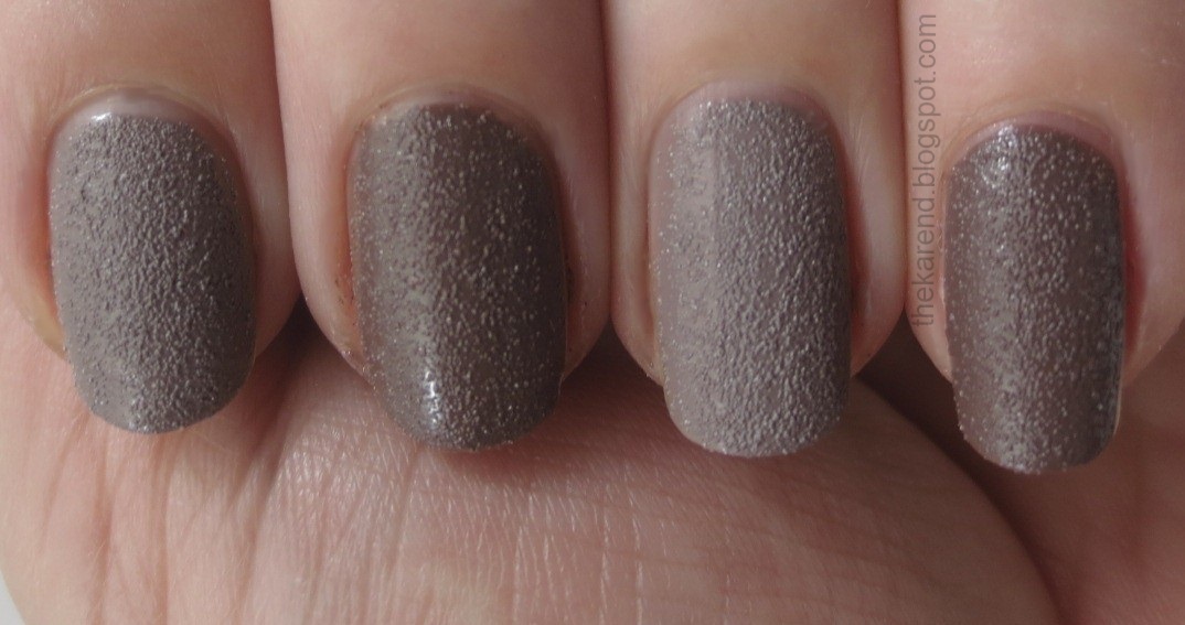
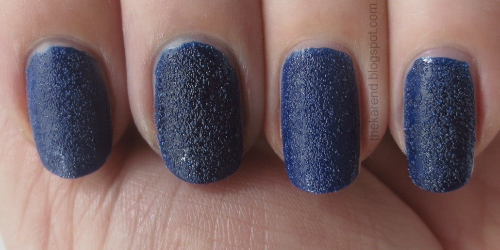
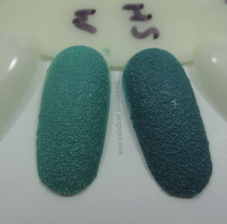
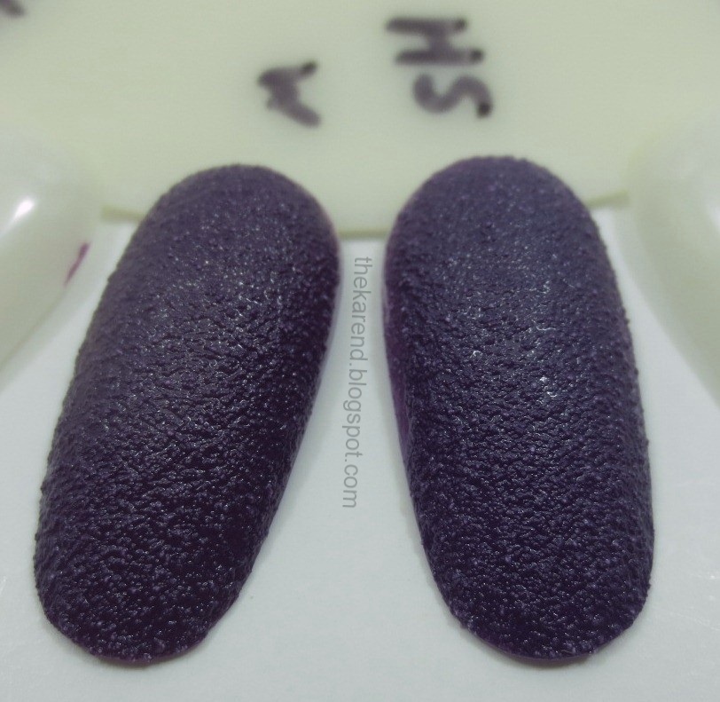
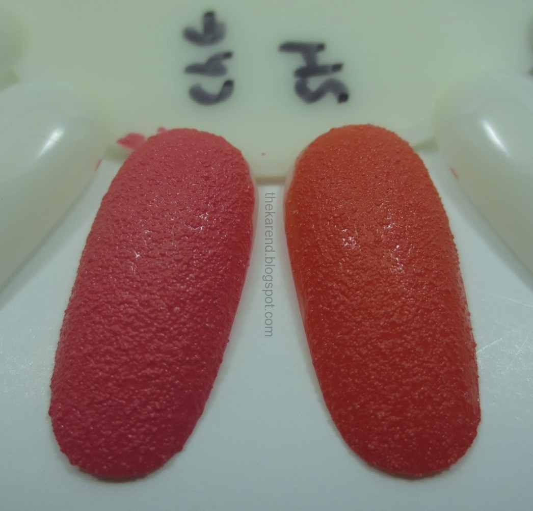
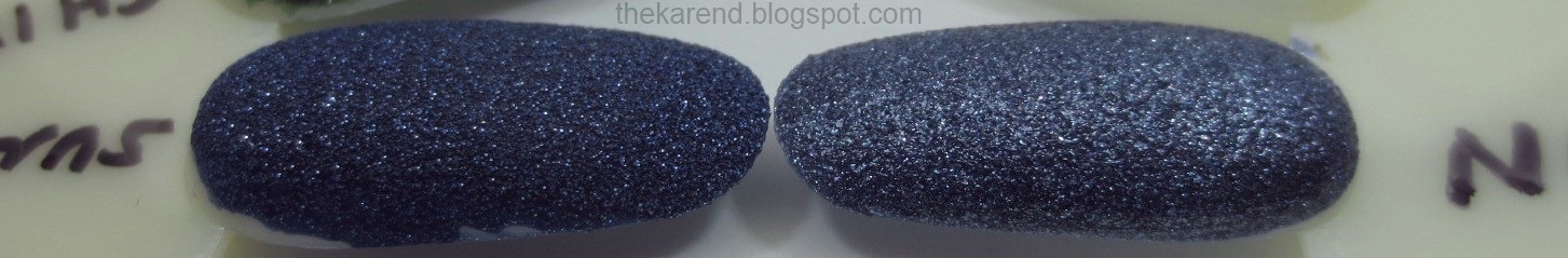
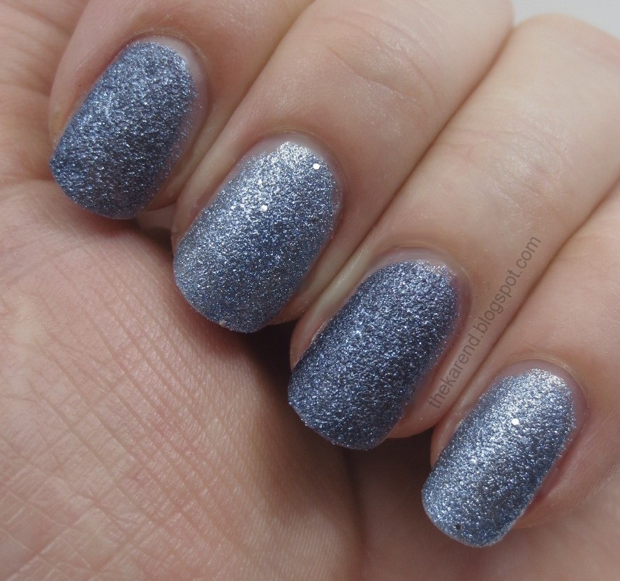
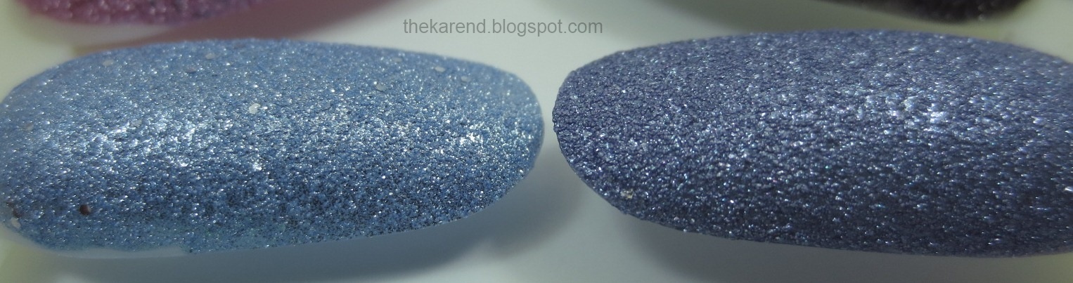
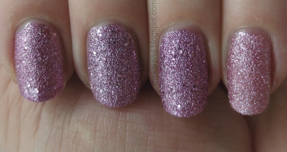
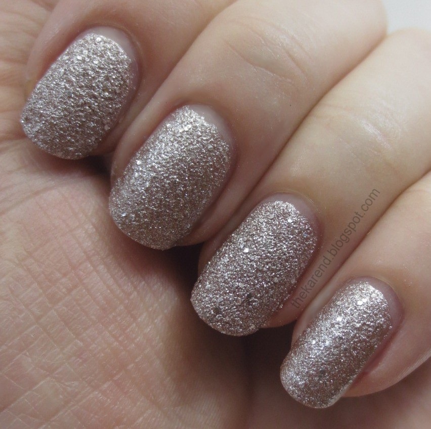
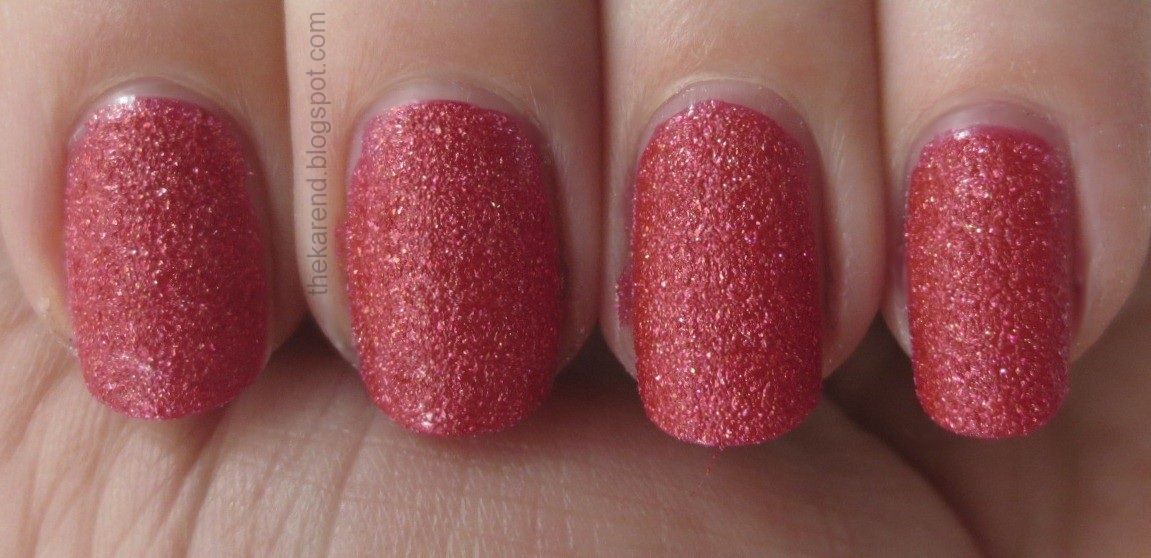
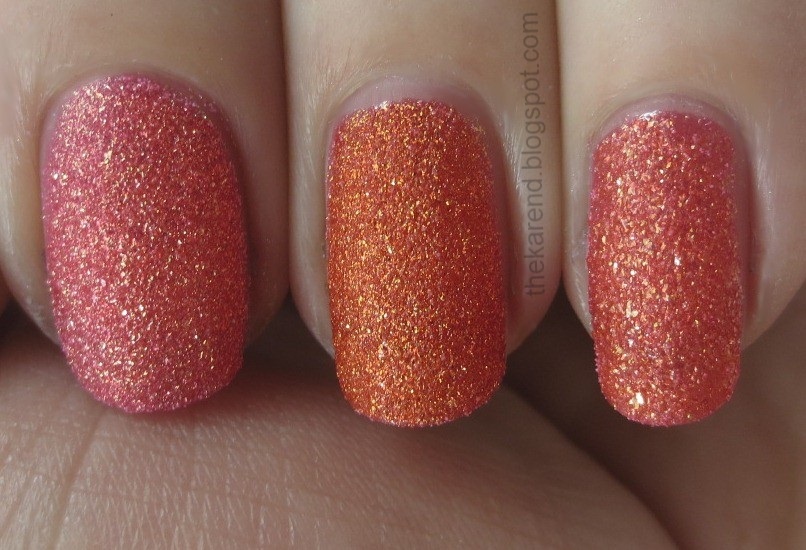
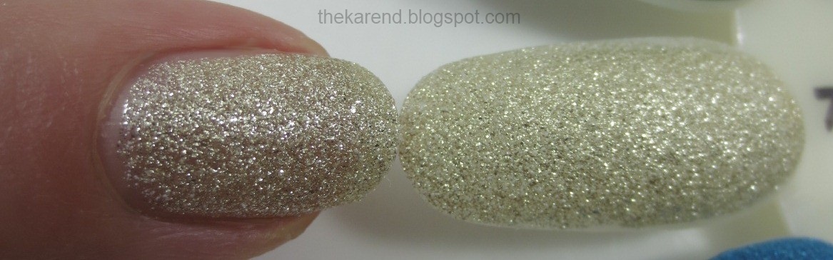
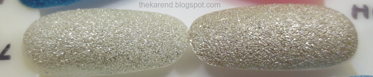
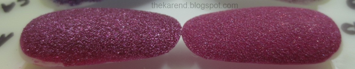
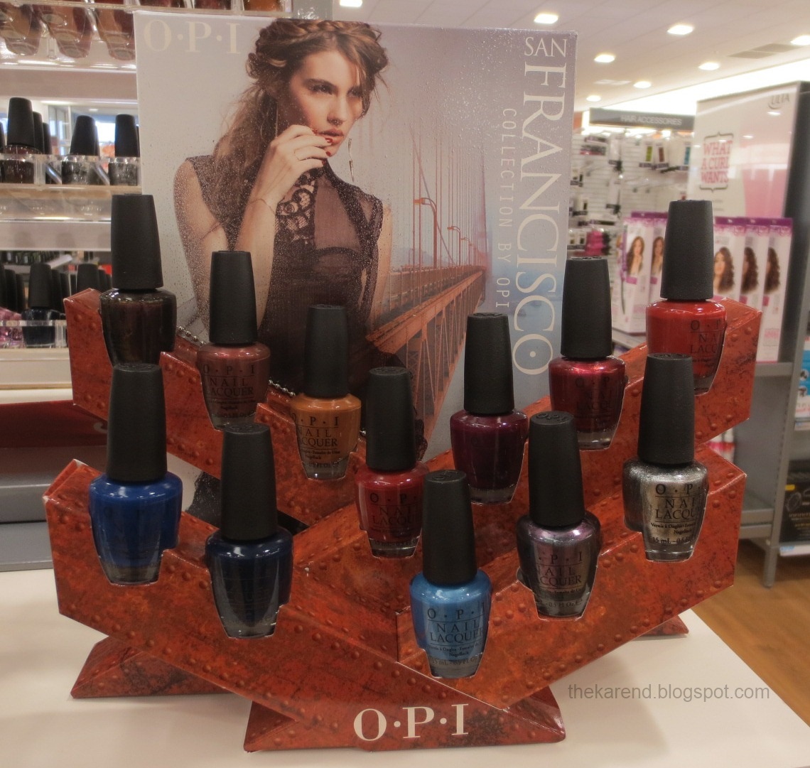
OPI's Fall 2013 offering is the San Francisco collection. As usual for their fall collections, it has 12 shades, which I am too tired to type out the names of right now (I'll do it when I share swatches in a couple/few weeks). There are also the three Liquid Sand colors I swatched for fall texture week; every time I've come across this at an Ulta, Alcatraz Rocks has been sold out.


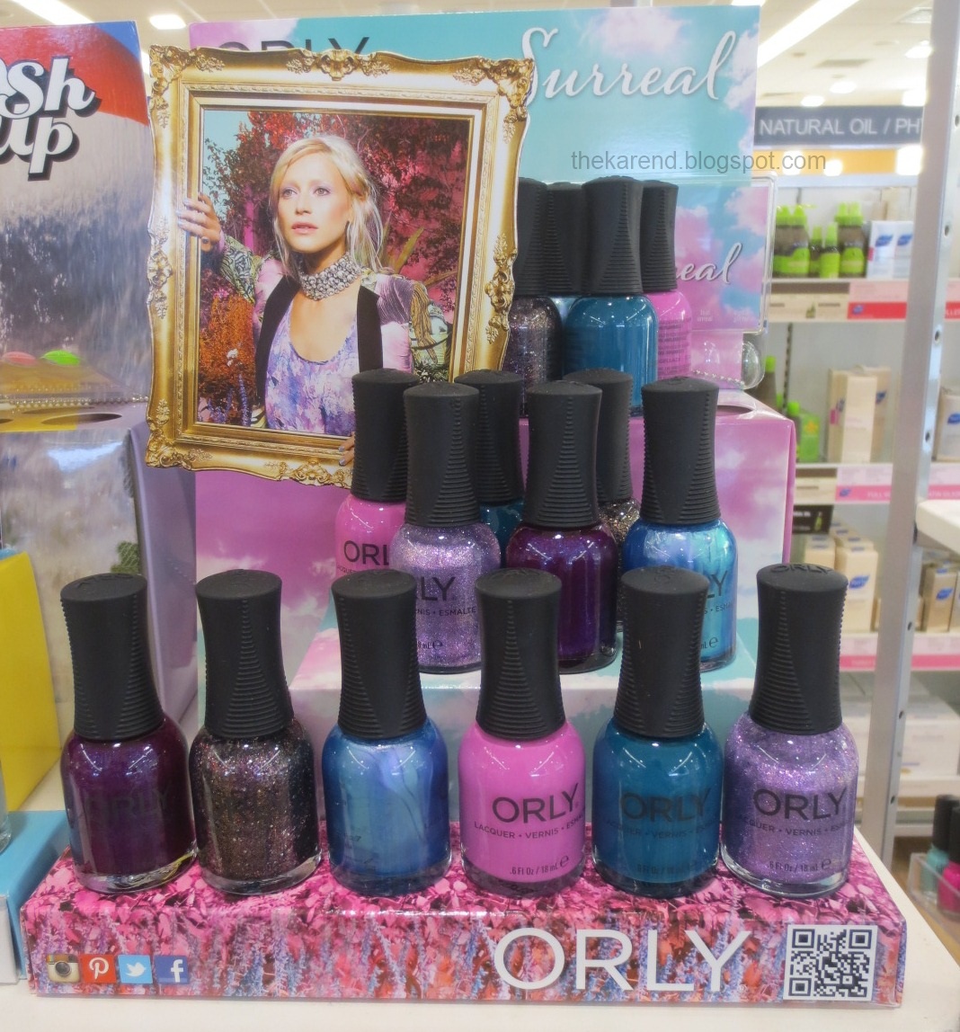
Ulta is also where I saw Orly Surreal, which has a very manageable six colors: Purple Poodle, Digital Glitter, Angel Rain, Pink Waterfall, Teal Unreal, and Pixie Power.


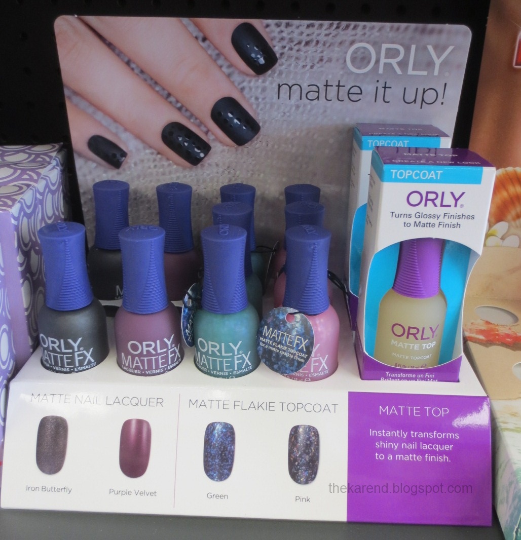
Sally Beauty had an Orly Matte It Up display with Matte FX. Iron Butterfly and Purple Velvet are existing colors in the new bottle style, but the two matte flakie topcoats, Green Flakie and Pink Flakie are new as far as I know. There was also Orly Matte Top in this display—look for a comparison with that coming up in September.


Maybelline has matte and flakies in their fall lineup, too. At Rite Aid and Bed Bath & Beyond, the 10 nail polish colors were split across two displays, same as how it's been with Maybelline's big seasonal collections in the Color Show era. The wide makeup display had two purple polishes: Lasting Lilac and Vintage Violet.


The all-polish display has the other eight colors: Sage Staple, Antique Teal, Red Relic, High Style Sienna, Ageless Olive, Mod Moss, Plush Plum, and Classic Camel.


At Walgreens, I saw a tall endcap display with all ten of the fall 2013 Maybelline nail colors (this is apparently called the Vintage Leather collection, though I didn't see that on the other displays) as well as the makeup shades for the season. The "sticker price" on the polishes ranged from a low of 2.99 at BB&B to 4.49 at Walgreens.

Sinful has a leather collection, too: Leather Luxe, which has seven matte shades (there's also topcoat, to make "patent leather" accents"). I've only seen this at Walgreens so far. Colors are: Laced Up, Strapped, Get It On, Cold Leather, Leather Loose, Whipped, and My Turn.


Walgreens is the only place to get Sinful Shine. On a recent visit, I saw the first shelf top display from the line since it was introduced earlier this year. I don't know if these colors are limited edition or new core shades; Sinful never tells. Regardless, there are eight of them: Who's the Gloss, Mirror Mirror, Shine Divine, Slick, Sleek, Rise & Shinier, Go Glossy, and Patent Pleasure.


In my last display post, I shared a triple decker music-themed display from Sinful Colors that I'd seen at Walgreens. Some of those same colors have since shown up at Rite Aid in two displays, neither of which has a name that matches the ones used on the Walgreens displays. Rock It seems to match up pretty well with the Glam Rock section of the bigger display. It's got Silver Screen, Daddy's Girl, Mesmerize, Secret Admirer, Glimmer, Opening Night, Sugar Sugar, and Black on Black.


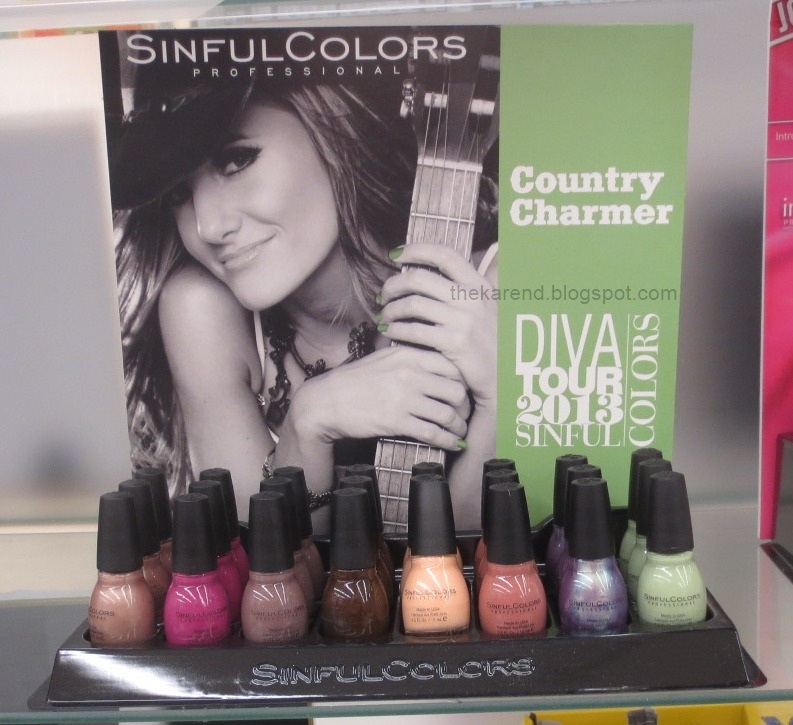
Country Charmer is like Country Chic from the other display. Colors here: Flirting Nails, Southern Belle, Graine de Poivre, Coffee, Skylark, Vacation Time, Rain Song, and Song of Summer.


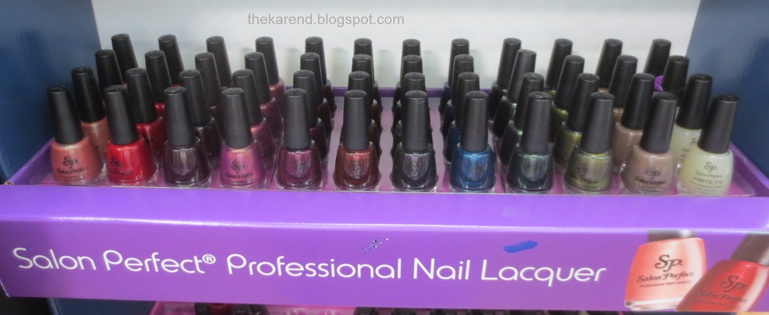
I heard Salon Perfect had some fall colors out, so I braved WalMart on a Saturday to see if I could find them. I got lucky. Not so lucky that the display was in good order, but a few minutes of my time putting the colors in their places and removing the ones that didn't belong (stray Sinfuls and Sally Hansens, for instance) made it look better.


There are eleven colors here: Tainted Love, Scarlet Enchantment, Playful Plum, Pink Taffeta, Raisin the Roof, Red Dahlia, Royal Knight, Nautical Nights, Ivy League, Dirty Martini, and Café Ole. There's also Matte FX top coat.


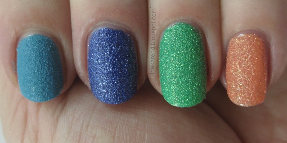
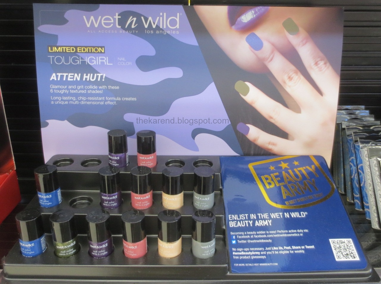
Wet 'n' Wild has entered the textured polish arena with Tough Girl, a collection of six colors: Left Left Left Right Left, Atten Hut, Beauty is a Battlefield, Fatigue Glam, Femme Trouper, and Tough Girl. I've only seen these at Walgreens so far.


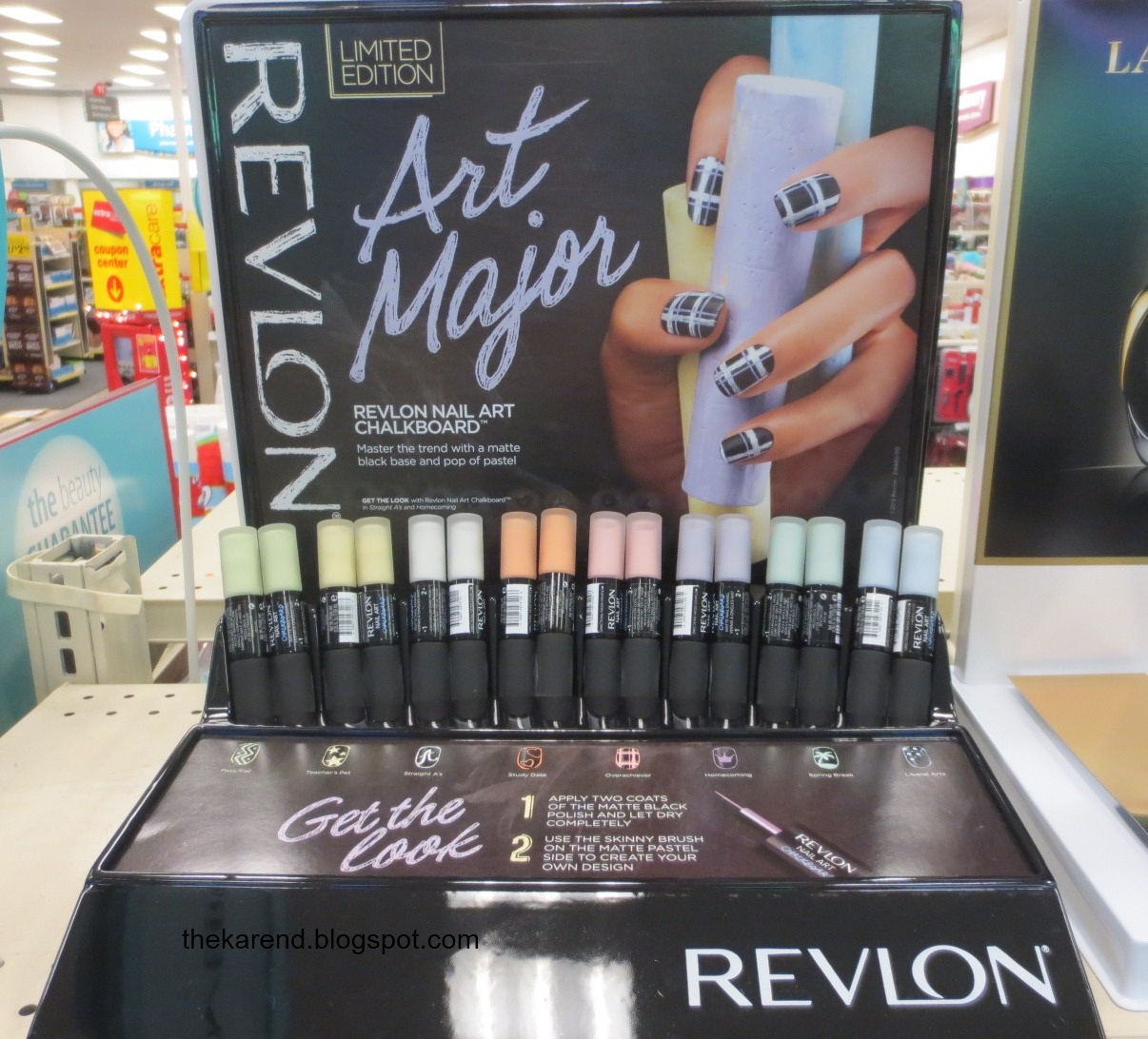
Revlon has a back to school themed limited edition collection of double ended Nail Art polishes called Art Major. These have matte black on one end and a pastel on the other; the pastel side has a skinny brush so you can make designs on your nails like you would on a chalkboard. There are eight variations on the theme: Pass/Fail (green), Teacher's Pet (yellow), Straight As (white), Study Date (orange), Overachiever (pink), Homecoming (purple), Spring Break (mint), and Liberal Arts (blue).


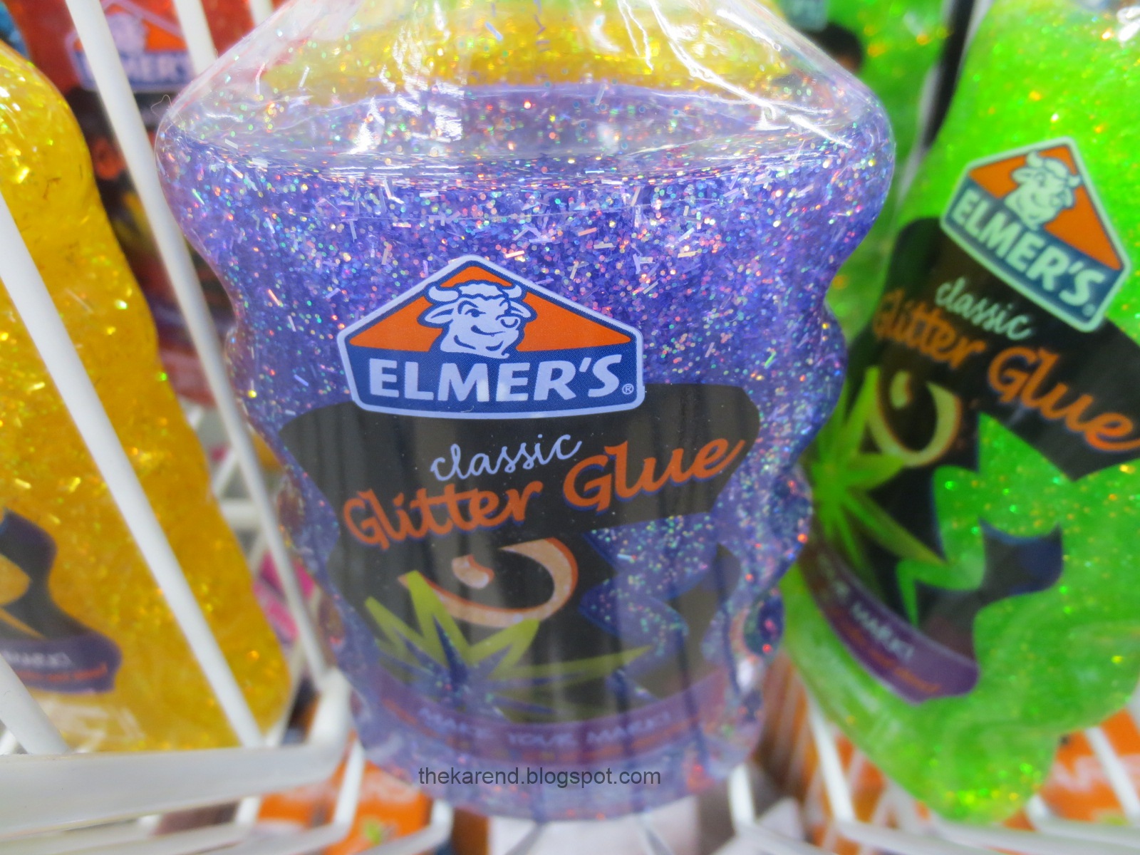
I'm going to leave it there for today. I'll save the Halloween displays I've seen for next time, as it's just way too early for Halloween. The kids in my district don't even go back to school until this coming Tuesday. In the school supplies section which will soon be completely overtaken by Halloween, I saw some glitter glue that looked like something I'd buy if if were nail polish. (I chuckled when I saw this was called "classic"; in my mind, the classic way to combine glue and glitter is putting white glue down and then sprinkling loose glitter on top and making a big mess.)


I'm going to take next week off, turning the long holiday weekend here in the U.S. into a holiday week. I'll likely pop up online here and there but won't be posting new entries. When I come back, I'll bring Nail Wheel Wednesday with me, fresh off summer vacation.

Thursday, August 29, 2013

Lovely Swaps with Lovely Ladies

In my recent textured polish comparisons post, I included a Kiko Sugar Mat color and mentioned that I'd gotten it and other Kikos and polishes in swaps I'd done with two international bloggers. Since both the swaps happened around the same time and both centered on Kiko polishes, I'm going to share goodies from both of them in this post.

My swap partners were Akuma Kanji (not her real name) from Under the Gravity's Nails and Julie Vernie (not her real name, either) from Les récits de voyage de Julie Vernie. Akuma and I have swapped before a couple times before. This was my first swap with Julie. I certainly hope these will not be my last swaps with either of these kind and generous ladies.

The starting point for both of these swaps was my desire for Kiko Sugar Mat colors. I split up my wish list and both Akuma and Julie were kind enough to go shopping for me. They also shopped for a friend of mine who was looking for some Sugar Mats as well, and I greatly appreciate that, because I'm sure it was a bit confusing when I was asking if they could get one of some of the colors but two of others.

Here are shimmery Kiko Sugar Mats posed with some of the exotic candies Akuma sent in her package. Left to right, 644 Sea Blue, 639 Golden Mandarin, 646 Starry Black, 643 Spring Green, 645 Burgundy.


This quartet of Sugar Mats from Julie has two shimmers and two cremes: 640 Poppy Red, 642 Hot Pink, 637 Turquoise, and 636 Mint.


To round out the Sugar Mat category, I have 635 Wisteria and 638 Taupe (which is the one that made it into the texture comp post to wrap up Fall Texture Week) joined by 372 Nude from the regular line.


The container the trio of Kikos above are posing on protected some treats from Akuma, wonderful little fruits that were almost too pretty to eat, like this apple. (I did eat them, and they were tasty.)


I just didn't have enough time to do full hand swatches of all the Sugar Mats, but Skittles were possible, at least for a couple hands' worth. I started with 642, 640, 645, and 646, as I was very curious about how these would compare to textures I already had in my stash. All of these were two coats.


Flipping through my nail wheels, I couldn't find anything quite like 642 Hot Pink. The shimmery textured pinks I already have are all lighter or darker or more berry toned than this Kiko. Even when I looked at creme textures in my stash, I still didn't come up with a color like it. For the other three, I had more success. I love finding dupes and "close enough you don't need both" pairs, especially when the brands span continents, so I had a lot of fun with these Kikos.

640 Poppy Red is really more orange—perhaps there was a translation problem. It's similar to Julie G Sugar Rush, just a tad darker. (Sorry about the focus problem here; I find it hard to get my nail and the nail wheel tip lined up just right.)


645 Burgundy is a pretty darn good match for Nicole by OPI Cinna-man of My Dreams.


646 Starry Black and Zoya Dahlia are twins as well.


The next quartet of Kiko Sugar Mats I grabbed for skittling consisted of 637, 644, 643, and 639. These were also two-coaters.


The only one of these that I found a close relative of was 639 Golden Mandarin, which is quite similar to Zoya Beatrix.


There were more fun things in these swap packages but as I'm running out of my blog post writing time slot here, those will have to wait for future posts, except this surprise from Julie which I just can't resist sharing right now—sample packs of Kiko nail polish strips. I didn't even know Kiko made nail polish strips. I am very curious to see how they compare to stateside brands but that, too will have to wait.


I feel so fortunate to have connected with these two ladies via the magic of cyberspace. Thanks you two!

Wednesday, August 28, 2013

NYC In a New York Color Minute Sampler

Earlier this summer, I was contacted by a rep for NYC New York Color, asking if I was interested in sampling some of their products. I was, and today I've got six shades from their NYC In a New York Color Minute quick dry nail polish line.

These seemed to naturally group into two trios, so that's how I went about swatching them. First up, what I'm calling the Nostalgic Trio, because it reminds me of some of the first nail polish colors I ever bought and wore way back in the mists of time: Wall Street, Central Park, and Radio City Rose.


Wall Street and Central Park are both quiet, traditionally feminine colors and share the same finish, what I think of as old school shimmer, so I wore them together. I used Wall Street, a cotton candy pink, as the accent, and Central Park, a dusty peach, as the main color. Both were three coats, no topcoat.


These two really glowed nicely in low light:


Radio City Rose is a deep berry pink creme. Here's two coats of it, no topcoat:


For fun, I added dots of Central Park on top of Radio City Rose and then some topcoat to smooth out the dots.


The second group is what I've dubbed The Bright Trio: Spring Street, Prince Street, and Lexington Yellow.


I wore all three of these together. Lexington Yellow, a medium yellow creme, went on most of my nails, with Prince Street, a purple shimmer, as an accent. Then I added dots near my tips. Yellow on the purple, and vice versa, with Spring Street, an orange creme, dotted alongside on all my nails. Topcoat finished off the look (my impatience shows in a couple spots where I streaked the dots into the base color because I couldn't even wait two minutes for the dots to dry). I used four coats of Lexington Yellow. I probably could have stopped at three but I'm always looking for streaks when applying medium to light yellows and think I imagine them even when they don't exist. Prince Street I did stop at three coats.


On the brand's website, you can see more colors in this line and other products from NYC New York Color. All are reasonably priced (In a New York Color minute go for around $1.99 around here).

Because I am seriously overstocked with polish, I asked and got the go ahead to pass along these colors to my readers, so if you'd like your name entered in the draw, fill out the form below, indicating which trio you're interested in. International entries are welcome, and I'll draw winners September 12, so get your name in before then. Note that I am giving away the exact bottles I used, so if you're squicked by polish someone else has tried, sit this one out.

The polishes shown in this entry were provided free for review purposes. The content of the entry was not dictated by the provider.

UPDATE: Contest is now closed.


Monday, August 26, 2013

OPI Couture de Minnie Collection

I shared Magazine Cover Mouse from OPI as part of Fall Texture Week last week, but there were four other colors in the Couture de Minnie collection which came out this past summer. As with the Liquid Sand, I didn't swatch the review bottles before I forwared them to my review partner Lucy but bought my own bottles later. It seemed only right to finally swatch them all. The full lineup is below: Magazine Cover Mouse, Minnie Style, Chic from Ears to Tail, A Definite Moust-have, and Innie Minnie Mightie Bow.


Last week I shared the Liquid Sand, Magazine Cover Mouse, on its own and with topcat, so I won't repeat that today. I will show it to you topped with Minnie Style, which is white and pink hex glitter in a clear base. I'm not exactly sure how many colors of pink glitter there are, as some seem to shift; they definitely range from the red end of the pink spectrum all the way to red violet.


Minnie Style was pretty well behaved for a chunky glitter. I didn't have any trouble getting the hexes out of the bottle and only a little bit of pushing was needed to distribute them around the surface of my nails. It didn't really need topcoat to smooth it out, so I skipped that step for these swatches.


Chic from Ears to Tail is a medium pink with an extremely subtle shimmer. In the bottle, I could catch pops of white and pink, but on the nail they were really hard to see. I used three coats to get full coverage.


It makes a nice base color for Minnie Style, as it's light enough to provide contrast for all the pink glitter colors but not so light that the white glitter blends in to the background.


I swatched the last two colors together as my attention was staring to wane—I can only take so much pink at one sitting). A Definite Moust-have is a warm reddish deep pink with subtle shimmer; I accented it with Innie Minnie Mightie Bow, which is red with a more pronounded shimmer. Both were two coats. I didn't use topcoat but looking at the photos, think maybe I should have to bring out the shimmer.


Of course I had to try Minnie Style over these as well.


They definitely stuck with the same pink and red and reddish pink theme as last year's Vintage Minnie Mouse collection. I'm still waiting for the black and white and red with an accent of yellow Minnie collection I have in my head. Maybe next year.


Friday, August 23, 2013

Fall Texture Week Comparisons

In preparing for this post, I went back and looked at the comparisons post I did to wrap up the first Texture Week here on the blog. I was amused to see this statement: "This probably won't be the last you see of texture here on this blog, but I can't imagine there will be this much in this short a time ever again." Ha, I say to that now. This week did have fewer polishes and fewer posts than that first Texure Week, but it was still pretty packed. It would have been more so if I'd had the found the time to swatch all of my latest textured acquisitions, and there's yet another collection I haven't found in stores to buy yet but I hope to soon. Just as well I didn't have more swatches done; as it is, I've got plenty of comparisons to round out this Fall Texture Week 2013.

Let's start with the creme texture comps. First up, some silliness that I couldn't resist doing: pitting OPI It's All San Andreas's Fault against some shiny OPI cremes in the same color family, Over the Taupe and You Don't Know Jacques. To my eyes, Over the Taupe's base color is a good match for It's All San Andreas's fault, with You Don't Know Jacques being a bit darker and cooler. Top to bottom below: OTT, IASAF, YDKJ, IASAF.


I do have a textured polish to compare to It's All San Andreas's Fault, Kiko 638 Taupe. This is one of the recent acquisitions I spoke about not being able to get to in time to swatch for this Texture Week. It came to me from my swap buddy at Under the Gravity's Nails (she sent a bunch of other pretties, too, and I also got more Kiko textures and other goodies in a swap with Julie Vernie; I hope to post about both of those wonderful swaps before too much more time passes). The Kiko is lighter and cooler-toned than the OPI; I think you can figure out which is which below.


Moving on to the other OPI creme texture, I have these dark blues: OPI Wharf Wharf Wharf and Sally Hansen Laughie Taffie. The OPI is ever so slightly darker, but these are close enough that I don't think you need both. Left to right below: OPI, SH, OPI, SH.


It wasn't until I was some days into a manicure wear test that I realized I'd failed to do comparisons of the other three new Sally Hansen Sugar Coat textured creme colors, so I had to resort to nail wheel swatching.

Milani Aqua Splash is much lighter than Sally Hansen Spare-A-Mint, though they are definitely in the same neighborhood color-wise.


Milani Purple Streak and Sally Hansen Gummy Grape are look very much the same as each other in most lighting conditions. In bright light, the Sally Hansen looks a bit lighter than the Milani and it also seems to have a slightly cooler cast. Much as I love purple, even I can't say you need both of these.


China Glaze Itty Bitty & Gritty definitely leans more red/coral than Sally Hansen Candy Corn.


Moving on to glittery textures, I have another nail wheel comparison: Zoya Sunshine and Nina Ultra Pro Twinkle Twinkle. The Zoya is darker and has more of a matte appearance than the Nina, which is lighter, dustier, and more shimmery.


I knew from looking at the bottles that the Nina Twinkle Twinkle was not going to be a dupe for Julie G Blueberry Fizz, either, but I went ahead and did a comparison anyway. The Nina is darker and lacks the larger silver hexes that the Julie G has.


I apparently have some sort of blind spot when it comes to Nicole by OPI, as it did not occur to me until I was editing the photos for this post that I should have compared Nina Twinkle Twinkle to NOPI Blue-berry Sweet on You—based on this pic of Julie G Blueberry Fizz and NOPI Blue-berry Sweet on You from last Texture Week, it sure looks like the Nina and the NOPI might be close.


I had no trouble finding a dupe for Nina Shooting Star; Orly Silver Pixel is the same silver with the same sort of glitter mix. I can't tell them apart on the nail, but for the record, below it's Nina, Orly, Nina, Orly.


In the category of rosy pink textured glitters, Orly Pink Pixel, Julie G Crushed Candy, and Nina Ultra Pro Star Bright are like peas in pod; you definitely don't need all three. The Julie G is maybe a touch lighter and more silver-y than the other two but no so you'd notice in most lighting situations. Sally Hansen Treat Heart is the odd one out; it's a warmer and lighter pink than the other three and lacks the larger hex glitter that they share. Left to right below: Orly, Julie G, Nina, SH.


Icing Sand Castle and Orly Rose Pixel are nearly identical twins. Maybe the Icing is a touch more textured and the Orly a tad more silver-y, but that could just be the light. Top to bottom below: Icing, Orly, Icing, Orly. Now I'm sort of curious to know if Icing did dupes of the other Orly MegaPixel FX colors. Not so curious I'm going to make a special trip to the mall, though.


OPI Magazine Cover Mouse and Julie G Hot Cinnamon could go to a twins festival together, too. Left to right below: OPI, Julie G, OPI, Julie G.


In the not so identical department, we have OPI Jinx, Zoya Dhara, and Julie G Sugar Rush. They're all orange with golden highlights, but they vary in how red they lean. Left to right below: OPI, Zoya, Julie G.


I'm going to round out this post with a couple of nail wheel comparisons, since I don't have all of these polishes in my collection now (not to say I won't get them later if there's a sale or swap opportunity). But first, a quick illustration of why I use white nail wheels instead of clear—they really do give me a good idea what the polish will look like on my nails. (If I could have gotten my finger and the wheel at the same distance from the camera lens, that would have been good, but I'm only so coordinated.)


Zoya Tomoko on the left, OPI Honey Ryder on the right:


Zoya Arabella and Nicole by OPI My Cherry Amour:


So there you have, the grand finale of Fall Texture Week 2013. Do you like mega comparison posts like this or would you rather see the relevant ones immediately following the swatches of each collection? Do you like theme weeks like this? If so, are there other themes you'd like to see me do? I appreciate any input you have on those questions or textured polish in general.

Some of the polishes shown in this entry were provided free for review purposes. The content of the entry was not dictated by the provider.